
Wallpaper and Window Treatment Coordination: A Designer’s Guide to Pattern Mixing
Photographer: Girls at Flourish Designer: Paige Williams
There's something magical about walking into a room where wallpaper and window treatments work in perfect harmony. Not matching - harmony. The walls might feature bold botanical prints while the drapery plays with geometric lines, yet somehow they feel like they were always meant to be together. Getting this right transforms a room from nicely decorated to thoughtfully designed, but it's also where a lot of people freeze up. Too safe, and the room feels flat. Too bold, and it can veer into chaos.
At Brave Maggie Designs, we've spent years perfecting the art of coordination. Whether you're an interior designer working through options for a client or a homeowner ready to take your space beyond basic, understanding how different prints play together changes everything. The scale relationships, the color threads that tie disparate designs together, the breathing room that makes mixing feel intentional rather than accidental - these are the details that separate exceptional rooms from ordinary ones.
Photographer: Girls at Flourish Designer: Paige Williams
Understanding Design Relationships
Mixing prints isn't about throwing together whatever catches your eye and hoping it works. It's about creating intentional visual conversations. The foundation lies in three key relationships: scale variation, color harmony, and stylistic compatibility. When these align, you can mix with confidence. When they're off, even beautiful pieces can clash.
Scale matters more than most people realize. Large-scale florals paired with another bold print create visual competition - your eye doesn't know where to land. But those same florals paired with a small geometric or solid texture in your custom drapery? Now you're creating rhythm and balance.
Photographer: Suzy Thompson Designer: LAH interiors
The Foundation: Starting with Color
Before you think about prints, nail down your color story. This holds everything together when you're mixing multiple designs. We typically start with your wall covering since it covers the most surface area and sets the room's overall mood. Once chosen, pull out the colors that speak to you - not every single hue in the print, just the ones you want to emphasize.
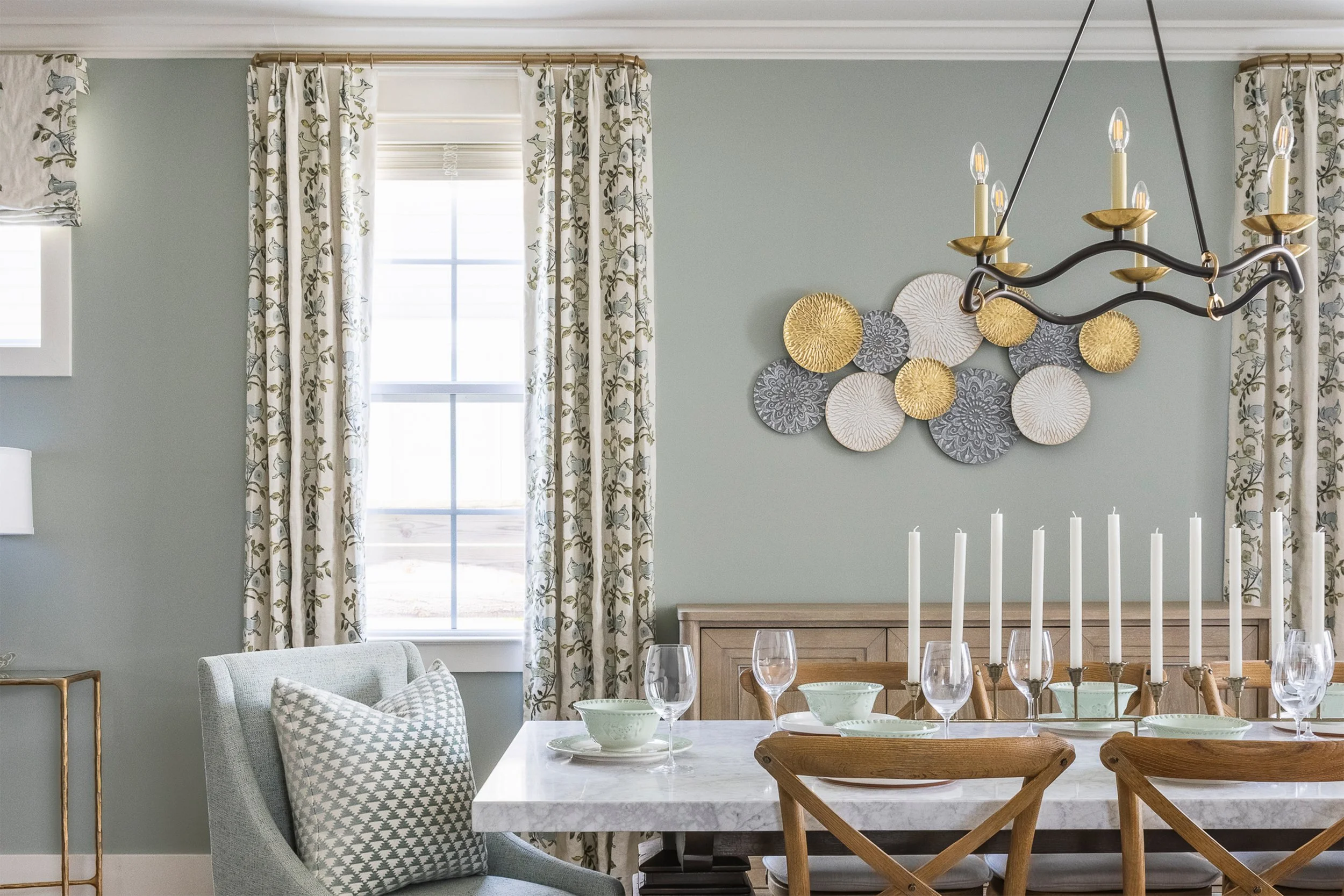
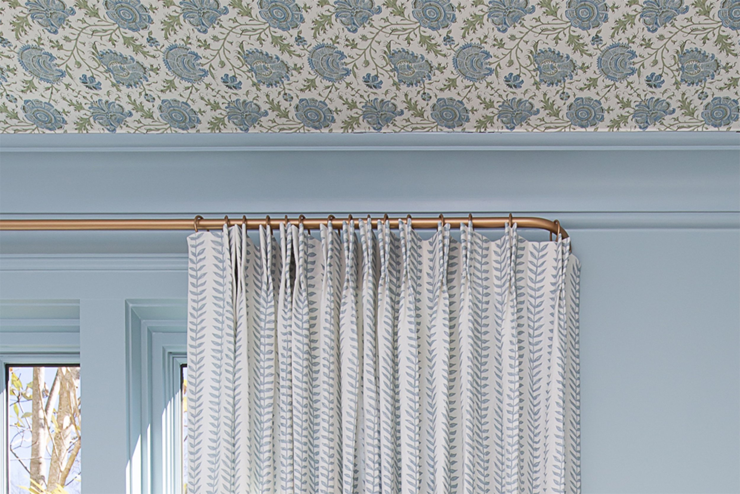
Those pulled colors become your guide for window treatments. Maybe your botanical walls have dusty blue backgrounds with coral florals and sage green leaves. You might choose coral velvet drapery to amplify warmth, or sage linen to create a cooler, more serene feeling. You're working with colors already present, creating threads of connection throughout the room.
Here's what works: limit yourself to three or four main colors across your walls and custom window treatments. You can have other accent colors in furniture and accessories, but your primary pieces should share a cohesive palette. This creates visual flow even when mixing wildly different styles.
Photographer: Girls at Flourish Designer: Paige Williams
Scale: The Secret to Successful Mixing
If color is your foundation, scale is your structure. Mixing at different scales creates visual interest without overwhelming the eye. We work with three categories: large, medium, and small. Your room should include at least two different scales, though three often works even better.
Large-scale designs make bold statements - oversized florals, dramatic damask, big geometrics. These work beautifully on walls or as statement drapery panels. Medium-scale designs bridge the gap. Small-scale motifs add texture and detail without competing for attention.
Here's a practical formula we use constantly: if your walls feature a large-scale print, pair them with medium or small-scale window treatments. If your walls are more subtle, you have the freedom to go bolder with custom drapery. The contrast creates visual balance.
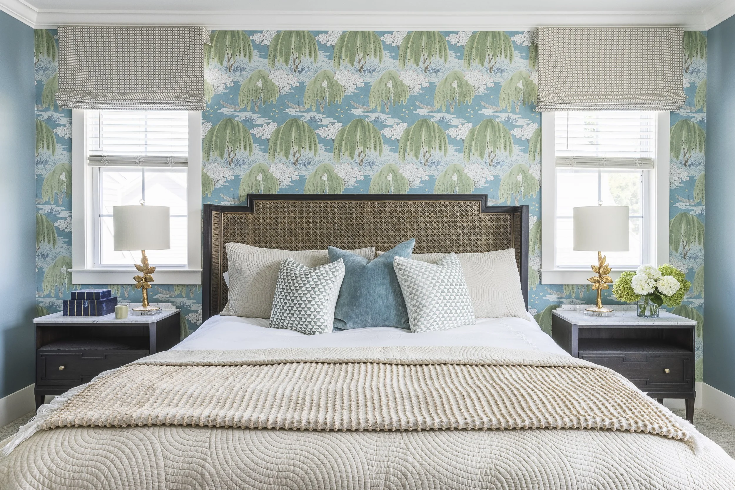
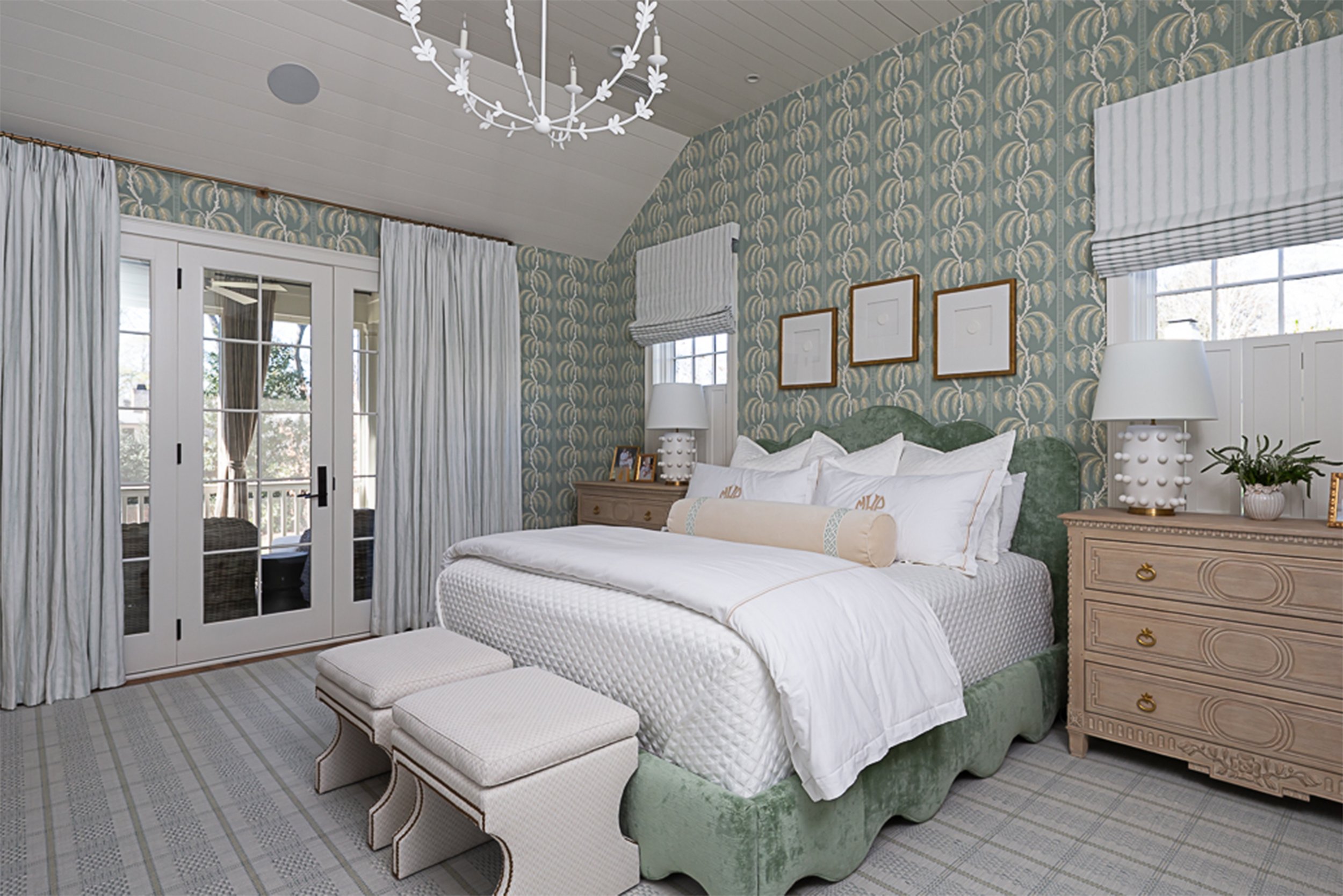
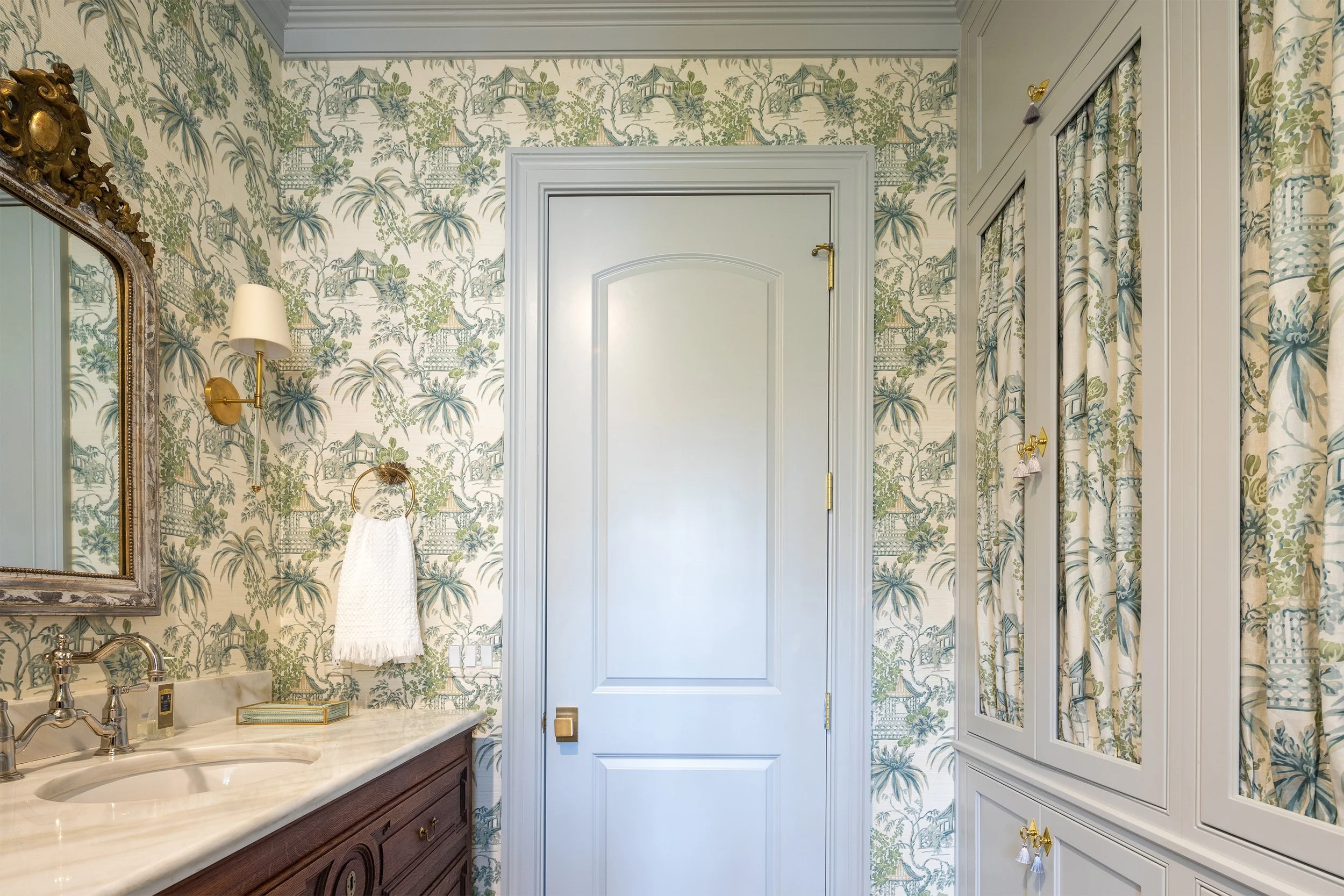
One exception worth noting: using the same design on your walls and in your fabric absolutely works when you want a cohesive, enveloping look. This creates intentional drama and works especially well in intimate spaces like powder rooms or bedrooms where you want that wrapped-in-luxury feeling.
Style Compatibility
Not all prints play well together, even if colors and scale work. The actual aesthetic personality matters enormously. Mixing traditional toile with ultra-modern geometrics can work, but it requires careful handling. More often, success comes from choosing designs that share some stylistic DNA.
Traditional: includes toile, damask, classic florals, and documentary prints. These pair beautifully with each other or with subtle textures.
Contemporary: leans toward abstract geometrics, modern florals, and graphic prints.
Transitional: bridges both worlds - think botanical, but rendered in a fresh, updated way.
We're not saying you can't mix traditional and contemporary - some of our favorite rooms do exactly that. But when mixing across style categories, let one dominate while the other provides subtle support.
Photographer: Kristen Mayfield Designer: EH interiors
Practical Mixing Approaches
The Coordinated Collection Approach
Many fabric houses create collections specifically designed to work together. Schumacher, Thibaut, Brunschwig & Fils - these design houses put serious thought into coordination. Using collections takes the guesswork out because the designers have already done the heavy lifting.
This doesn't mean you're limited to buying everything from one collection. But starting with coordinated pieces gives you confidence, especially if this feels intimidating. You might choose walls and drapery from the same collection, then bring in accent pillows from elsewhere.
The One Print & Texture Approach
If mixing multiple prints feels like too much, this offers an easier entry point. Choose either printed walls or printed window treatments, and pair them with a rich texture. Botanical walls with textured linen drapery. Solid grasscloth with bold chintz curtains. You still get visual interest and layering, but with less risk.
Texture does more heavy lifting than people give it credit for. Natural wovens, velvet, silk, even solid damask (which has a woven dimension) - these materials add depth without introducing an additional print. We use this approach constantly in spaces that need sophistication without busyness.
The Bold Mix Approach
For those ready to fully commit, this is where things get exciting. Multiple prints across walls, window treatments, and soft furnishings, all working in conversation. This requires the most careful planning but creates rooms with serious personality.
Maintain that color cohesion while varying your scales and balancing visual weight. Maybe you've got large-scale florals on the walls, medium geometrics at the windows, and small-scale patterned pillows. Everything shares your core palette, but each brings different energy.
Photographer: Kristen Mayfield Designer: EH interiors
Color Strategies
Monochromatic Harmony
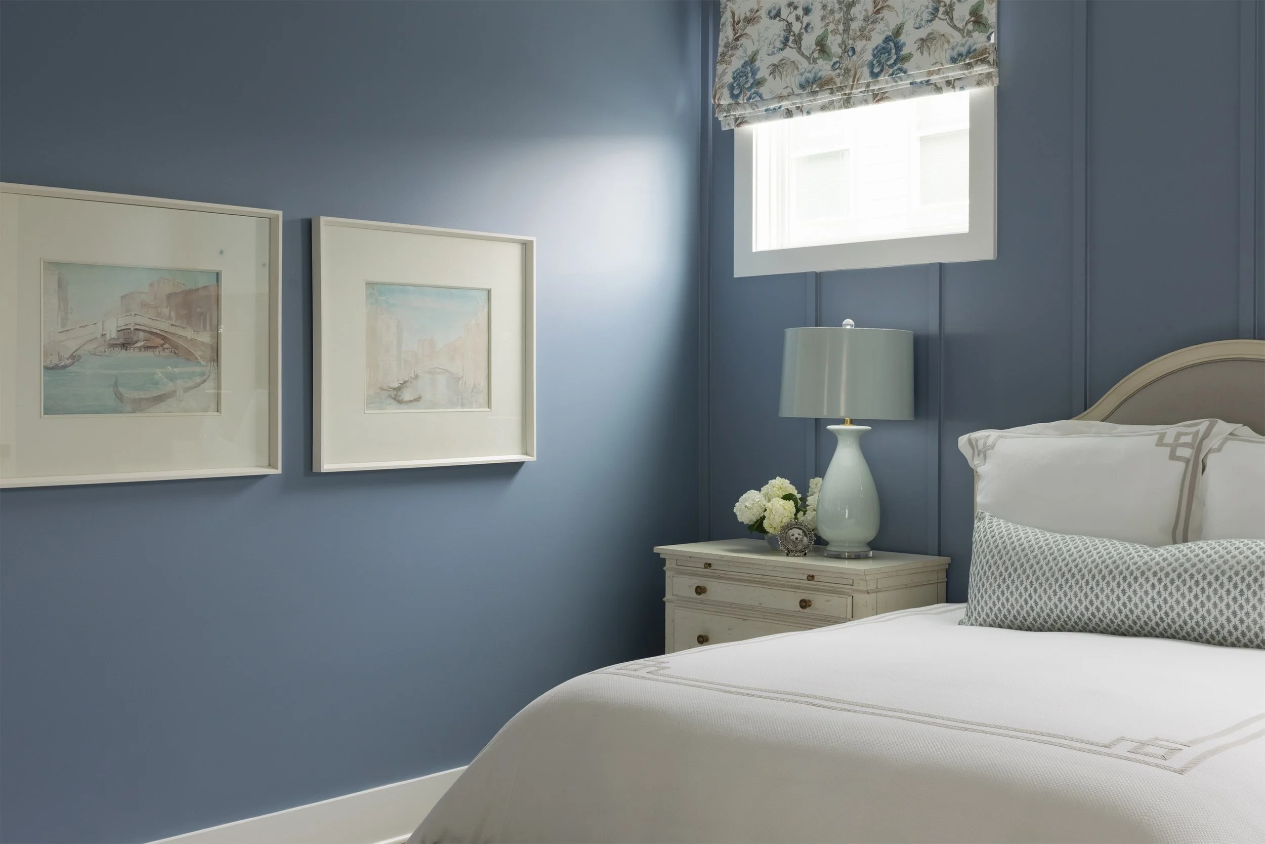
Working within a single color family - all blues or all neutrals - makes mixing significantly easier. You can go bold with variety because color consistency holds everything together. This feels sophisticated and pulled-together even when mixing dramatically different designs.
We love monochromatic schemes in bedrooms and studies where you want calm sophistication. Navy and white toile walls with blue and white striped custom drapery. Taupe damask with cream linen treatments.
Complementary Contrast
Using colors opposite each other on the color wheel - blue and orange, purple and yellow, green and pink - creates vibrant, energetic rooms. This requires confidence, but the results can be stunning. The contrast makes each piece pop while repetition creates cohesion.
Complementary schemes work beautifully in dining rooms, creative studios, even bold powder rooms. Just vary your intensities - if your walls use deep saturated colors, consider softer versions in your drapery.
Neutral Foundation with Accent
This might be the most versatile approach. Start with neutral walls or window treatments, then introduce print in the other element using accent colors. Grasscloth with jewel-tone patterned drapery. Cream linen curtains with richly printed walls.
The neutral element provides visual rest while the printed piece brings personality. This works in virtually any room and makes it easy to update your look over time.
Photographer: Kristen Mayfield Designer: EH interiors
Room-Specific Considerations
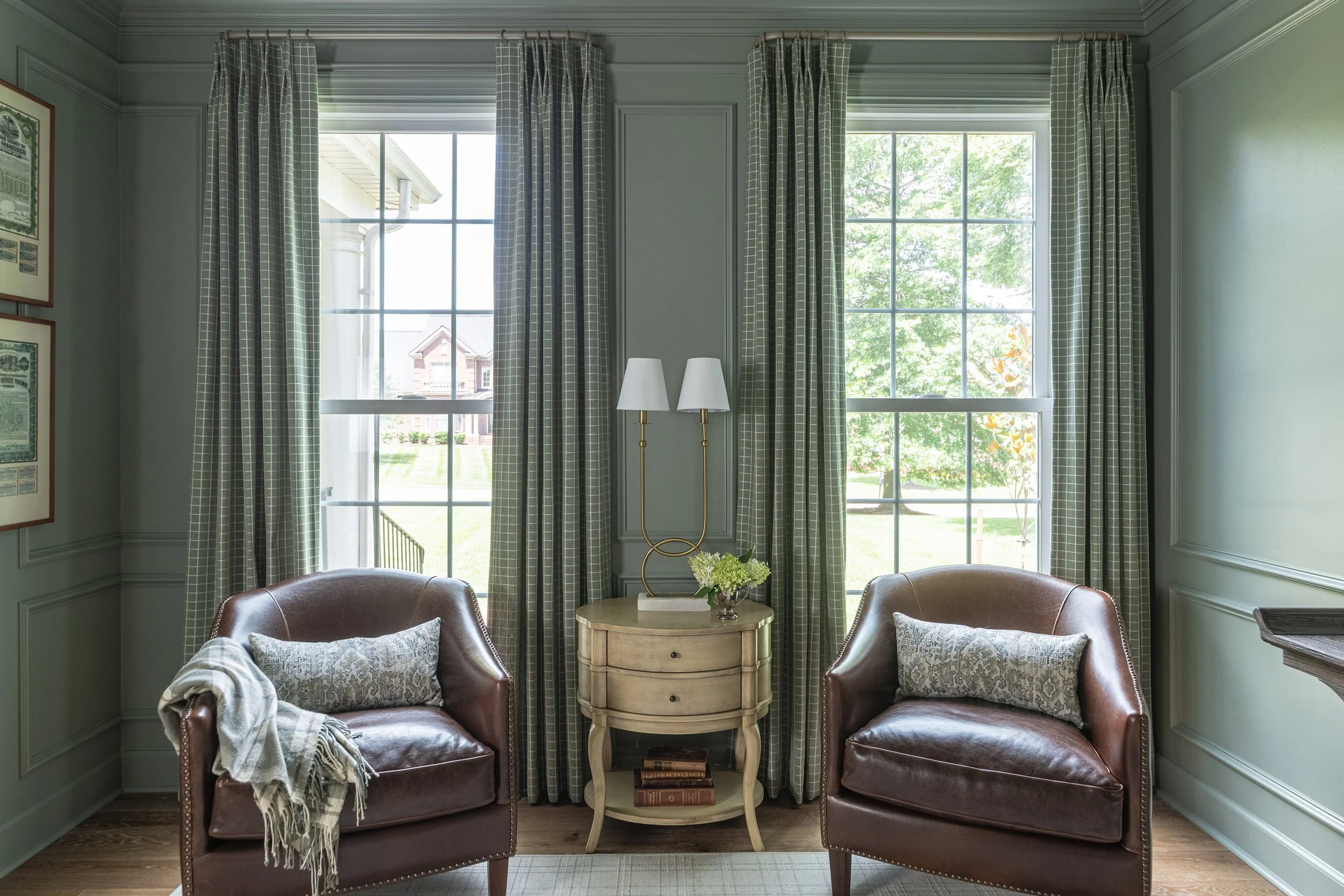
Living Rooms offer the most flexibility because they're usually larger spaces that can handle more visual complexity. We often go bold here - printed walls on a feature wall with coordinating custom drapery, or fully papered rooms with textured linen treatments for balance.
Bedrooms benefit from prints but shouldn't feel overstimulating. This is where monochromatic schemes really shine, or the one print plus texture approach. If you're going bold on the walls, consider solid or subtly textured custom drapery.
Dining Rooms are perfect for drama because you're typically not spending extended periods there. This is where you can push boundaries - bold walls, statement drapery, maybe even patterned upholstery. The key is creating an experience that makes meals feel special.
Bathrooms work beautifully with the same-print-everywhere approach in powder rooms. Matching walls and fabric roman shades create an enveloping, jewel-box effect. Larger primary bathrooms have more flexibility for mixing.
Technical Considerations
Light matters enormously. South-facing windows in Nashville flood rooms with bright light that can wash out subtle designs. In these spaces, bolder prints with stronger contrast work better. North-facing rooms receive softer light where delicate motifs can shine.
Consider how your custom window treatments look both closed and open. Most people think blackout lining is only for bedrooms, but when you have beautiful prints with rich colors, privacy lining can actually alter how the design appears. Light filtering through changes the color saturation and overall look. Blackout lining preserves the true colors and keeps the appearance consistent whether your drapery is stacked against the wall or drawn across the window glass. This is especially important for maintaining the integrity of coordinated wallpaper and window treatment combinations.
Room size plays a role, too. Larger spaces can handle larger-scale designs more easily than small rooms. But that doesn't mean you can't use bold prints in compact spaces - you just need to be thoughtful about how much surface area they cover.
Testing Your Choices
Never commit without testing them together first. Request large samples - the bigger the better. Small swatches don't give you accurate reads on how designs will interact at full scale. Pin or tape samples to your walls near the windows and live with them for several days.
Observe how they look in morning light versus evening. Notice whether they feel harmonious or competitive. Pay attention to your emotional response - do you feel energized or overwhelmed? Your gut reaction matters more than you think.
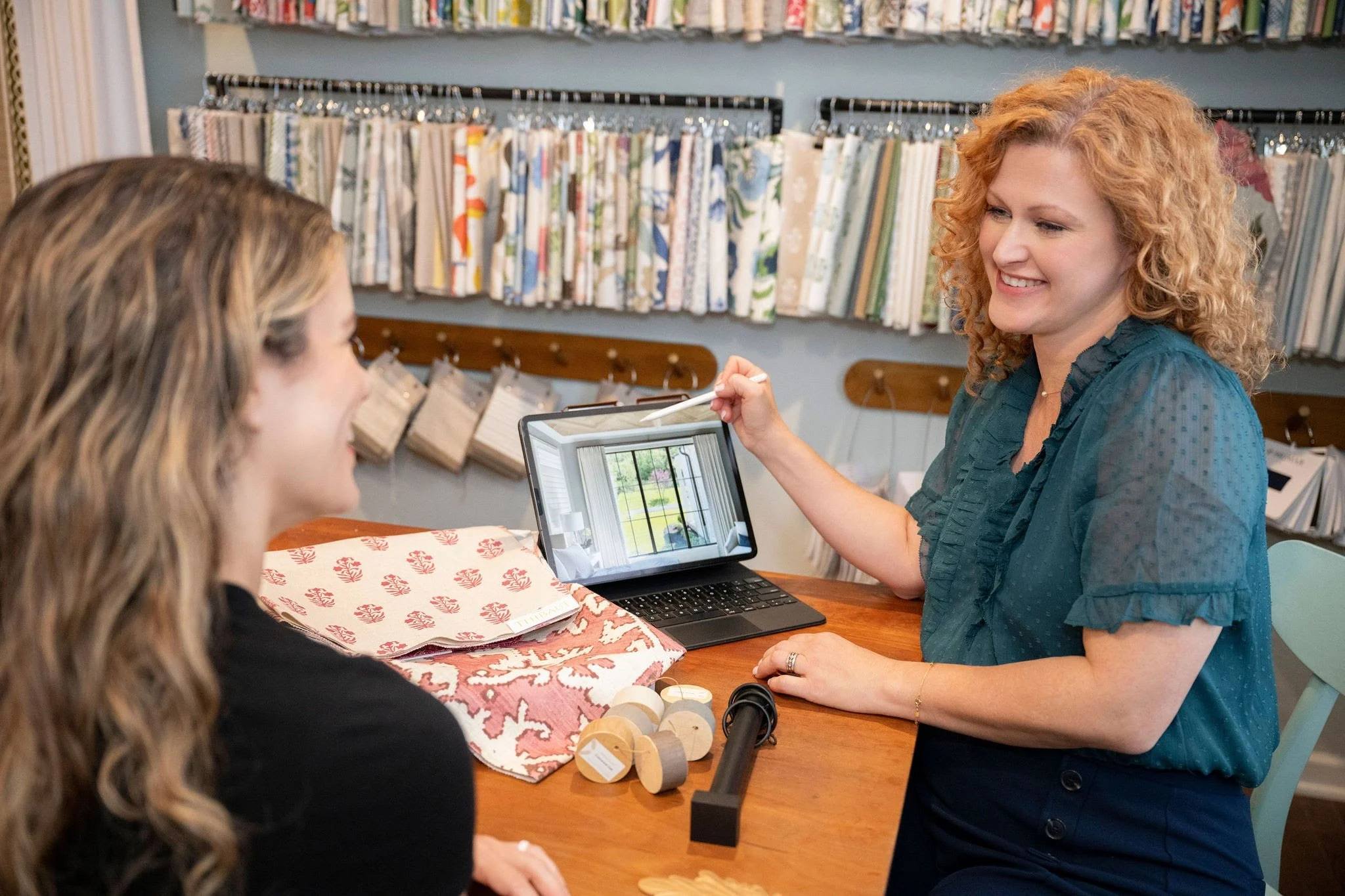
We always encourage clients to bring samples home rather than making decisions in our Franklin showroom. Lighting, existing furnishings, and the specific qualities of your space all influence how everything works together.
Common Mistakes to Avoid
Too much of everything is the most common mistake - multiple large-scale designs throughout a room where everything competes for attention. Remember that principle of scale variation.
Ignoring undertones creates subtle discord. Colors might seem like they match until you put them side by side and realize one has warm undertones while the other skews cool.
Forgetting about negative space is crucial. Mixing requires breathing room. Solid areas - whether in upholstery, rugs, or painted trim - give the eye places to rest.
Matching too perfectly can ironically feel flat. A little bit of tension or contrast makes rooms interesting. Don't be afraid of combinations that feel slightly unexpected as long as they share color and scale relationships.
Your Design Journey Begins
Learning to coordinate walls with custom window treatments opens up entirely new possibilities. That perfect combination of botanical prints with geometric linen drapery exists - it just takes knowing what to look for. The confidence to mix traditional toile with contemporary textures comes from understanding these fundamental principles.
We invite both interior designers managing client projects and homeowners designing their own spaces to explore combinations that might have seemed too risky before. Whether you're planning a complete room transformation or simply want to update one space, we're here to guide you through selecting pieces that work beautifully together.
Ready to explore coordination for your next project? Visit our Franklin showroom to see combinations in person and touch the materials that inspire you, or schedule your design consultation at bravemaggiedesigns.com. Let's discover the perfect mix to bring your vision to life!